Filmin - UX Case Study
Project Overview
With the aim of carrying out a high-quality master's degree project, I proposed to improve the user experience of the Filmin application, an online cinema platform that offers mostly auteur cinema, independent, but also some commercial cinema titles, in streaming and legal form. To make it a success, I asked Enric Mor, director of the UOC's User Experience master, to tutor my project.
The challenge
The challenge when redesigning the mobile application was to increase user experience satisfaction at least as much as the user experience you have when using the application of your competitors, such as Netflix or HBO.
The solution
The solution was to redesign the whole application so that it could be used with chromecast and also be used only from a mobile device.
ROLE
UX/UI Designer
CLIENT
Filmin
PLATFORM
Android/iOS App
TOOLS
Adobe XD, Marvel App, Illustrator
METHODS
Guerrilla usability testing, personas, user journeys, surveys, feature prioritization, affinity map, card sorting, user flow
DURATION
4 months
Objectives
The main objective of this project is the implementation of the redesign of the Filmin application to improve your user experience. In addition, the following three objectives were raised specifics:
- Discover how people use the mobile application of Filmin, specifically in the vision of series and online and offline movies.
- Identify problems or pain points in the user experience.
- Create solutions to solve those pain points and then validate them.
Methodology
On the one hand, research will be carried out on various techniques, such as, for example, a survey of users who have an account in some form of visualization of audiovisual contents, there will also be a card sorting, an affinity map, and a 2x2 prioritization map to see what is most important to change in the application for users. And finally, there will be a usability guerrilla test to clearly see which are the pain points of the app.

Research
Survey
In order to begin this research and have a database on which to base it, a totally anonymous survey of 30 people has been carried out. This survey has been created to find out the type of user who has an account on a streaming platform.
The most important results obtained by this survey were as follows:
- Netflix is the most popular platform used by users.
- Price is the main reason why users stop using a viewing platform.
- The time of day when most users use the viewing platforms is at night.
- Users usually watch movies, series, etc. alone or in pairs.
- The computer is the most used device for viewing, followed by TV and mobile.
Personas
Based on the results of the survey and previous secondary research, three provisional people were created who could potentially use Filmin. These people are there to help to decide design issues during the ideation phase.

Job stories
The main benefit of using job stories in product development is to define a greater understanding of the design problem. It has a clearly marked format, which it would be:

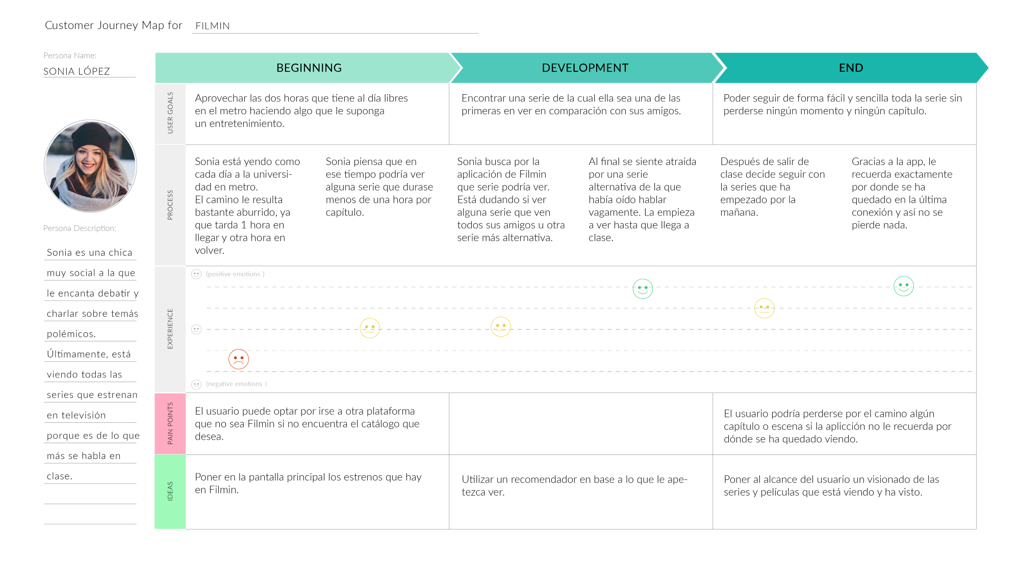
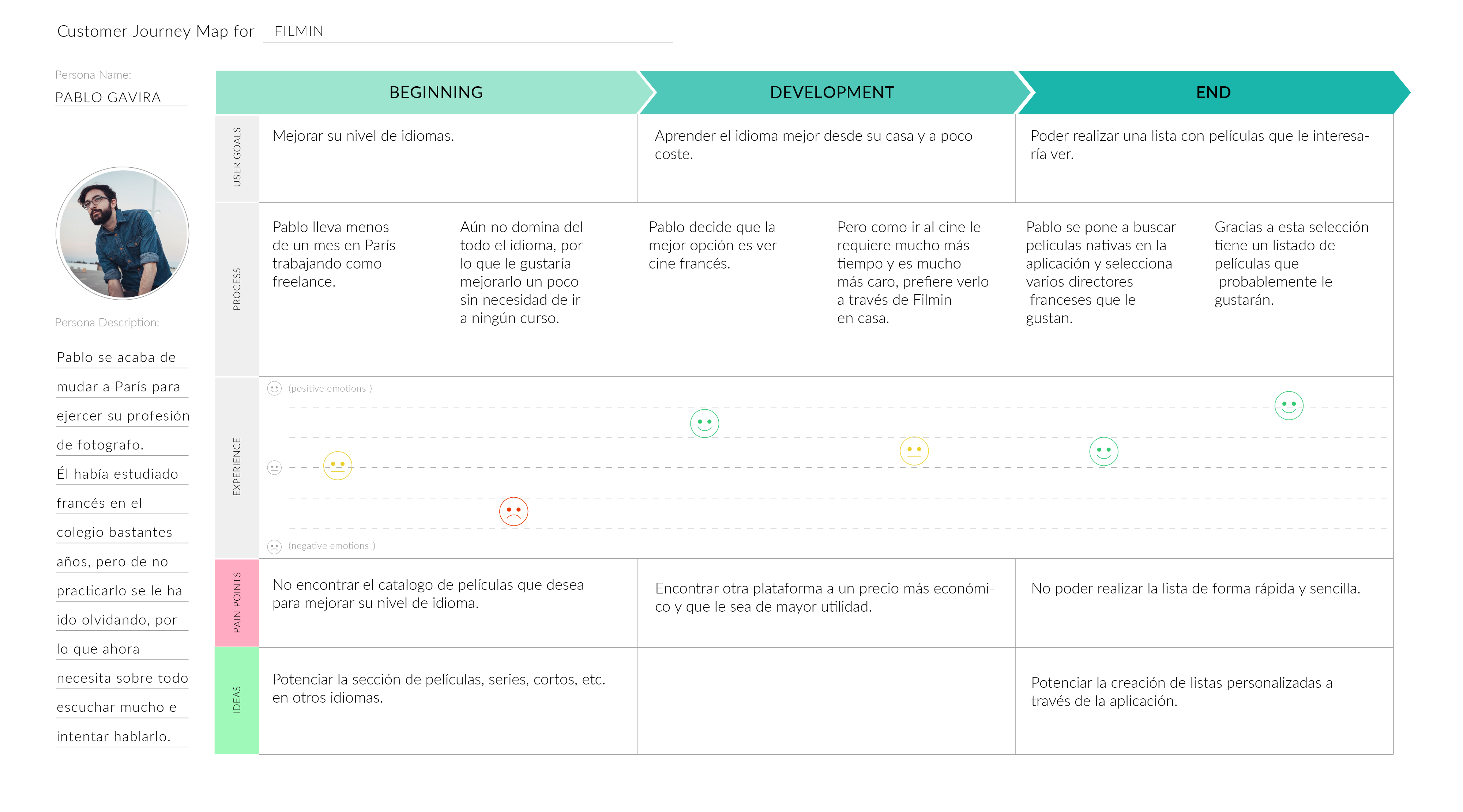
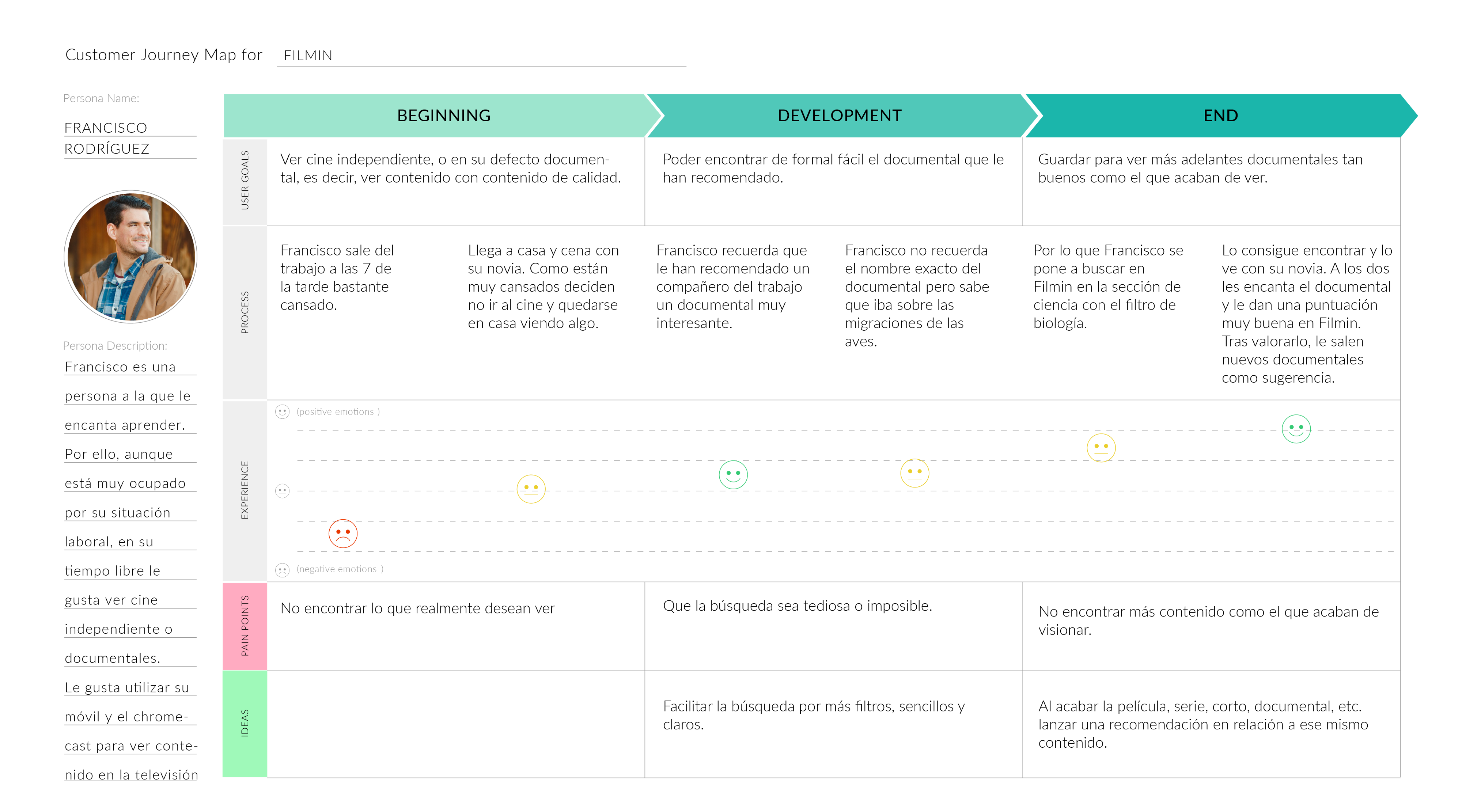
User Journey
In this case, three User Journeys have been made, one for each person. It explores the multiple measures taken by users as they relate to the application in an ideal scenario in which the application functions as it should. The experience map allows the user’s motivations and needs to be framed at each step of the journey, creating ideas and solutions for each step.
Guerrilla Usability Testing
The test was carried out with a list of tasks to the side without the moderator intervening so as to see which was the route that the users were taking and to see the route and more clickable sites. These five people were asked to perform a total of 5 tasks with the application, which were as follows:
- Create a list of movies
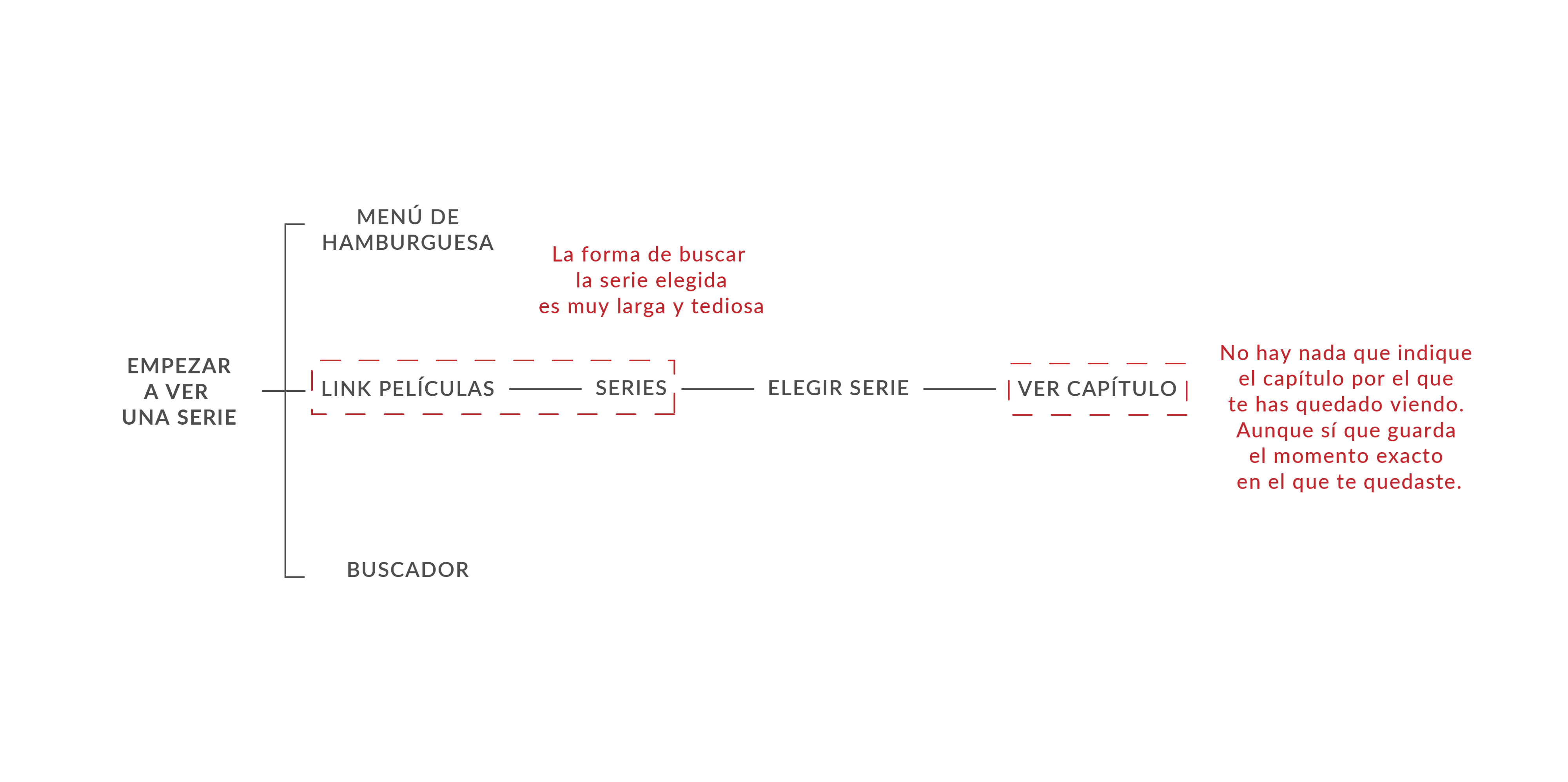
- Start watching a series or movie and see which chapter you’ve stayed for
- Find the Festivals section
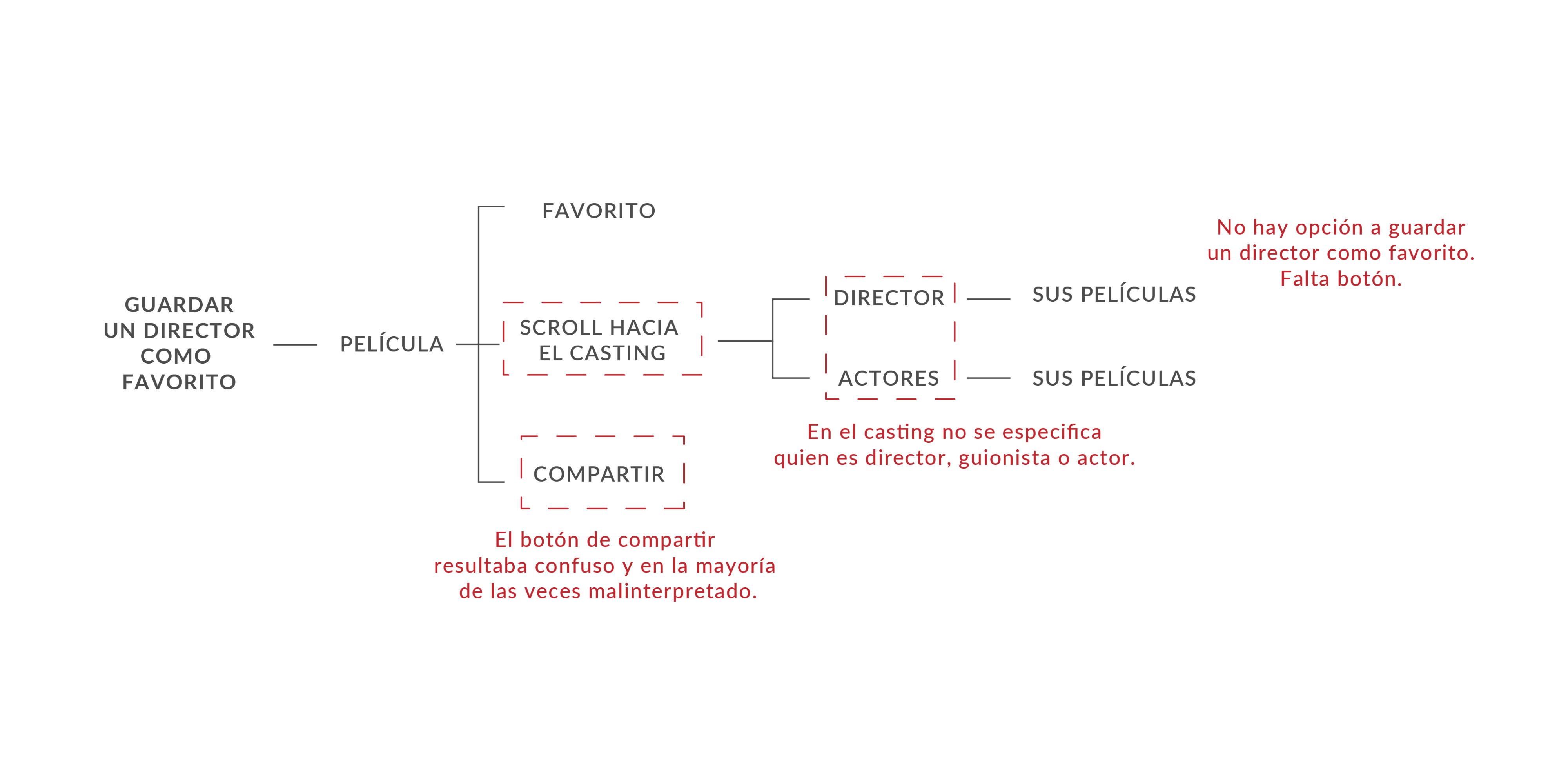
- Save a director as a favorite
- Start watching a movie that had previously been saved in the favorites list.

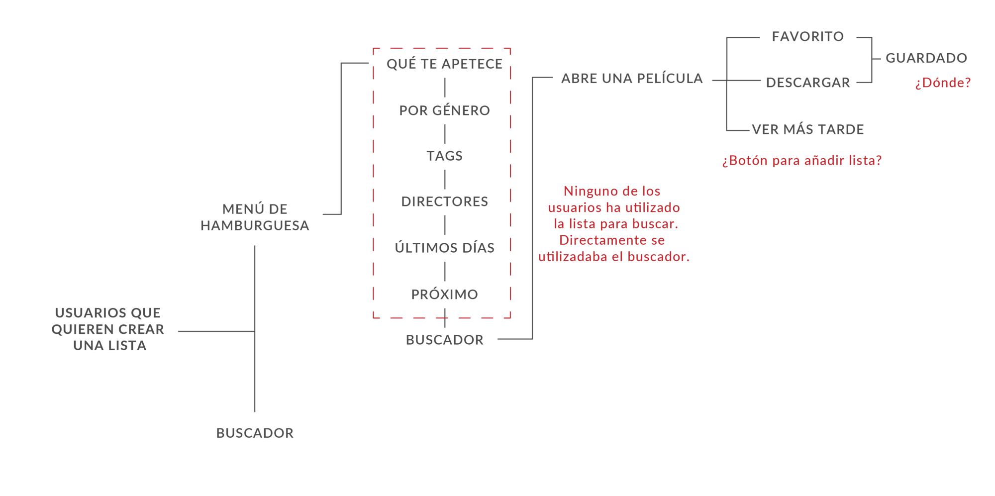
Task Flow
I analyzed the current task flow of the application of three actions that the test participants were asked to understand where the problem is. The other two actions, as they did not have a large task flow because they could not be carried out, simply analyzed the screen where no progress could be made.
Affinity Map
The affinity map provides a good way to identify and analyze problems. There are several variations of this technique. In short, the purpose of an Affinity Map is to generate, organize and consolidate information related to a product, process, complex problem or problem.
Then, by carefully reviewing the recordings of the guerrilla test sessions and listening to each user’s problems and complaints, an affinity map was created to group these complaints into categories.
This assignment is based on the task the user was performing and other general complaints. Thanks to this Affinity Map it was possible to draw conclusions that served to make the 2x2 map.

Prioritization of requirements
To help prioritize problems, a 2x2 map was made to classify problem categories by how important they are to the business (x-axis) and users (y-axis).
Assuming that the main business goal for the application is to drive mobile revenue, I decided that the pain points around the application navigation were the most important for the business and users. Thus, this 2x2 map served to prioritize tasks in the following order:
- Improve the search
- Improve the user experience
- Add View Tracking
- Adding web sections
- Sort filters and categories

Card Sorting
It was necessary to incorporate this technique because two important points to prioritize were the way of searching and the rearrangement of filters and categories. In this way, we wrote in pos-its all the sections of the web and we had 5 participants to perform the technique. The test consisted in grouping the words in a consensual way, adding and discard categories. The result was as follows:

Definition Pain Points
Pain point 1: Search form
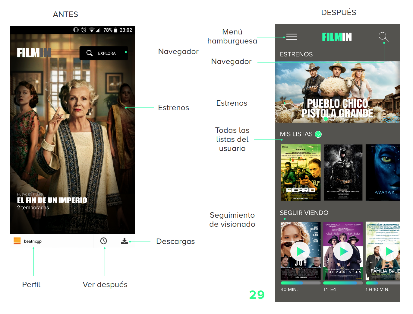
The way the application searches is totally confusing and users do not know which of the three search menus to choose. For this reason, it is proposed to unify the search form in one and as a secondary aid a hamburger menu in which the remaining options are.
Pain point 2: Unification of buttons
Users had difficulty knowing what a button was and the lower menu bar was completely ignored, as there is no uniformity in the design of the application and it is difficult to identify which zone is clickable.
Therefore, it is proposed to unify the style of the buttons to make it easier for the user which areas of the application are clickable. In addition, the lower bar will be removed and relocated as it is practically useless.
Pain point 3: Structure of the information
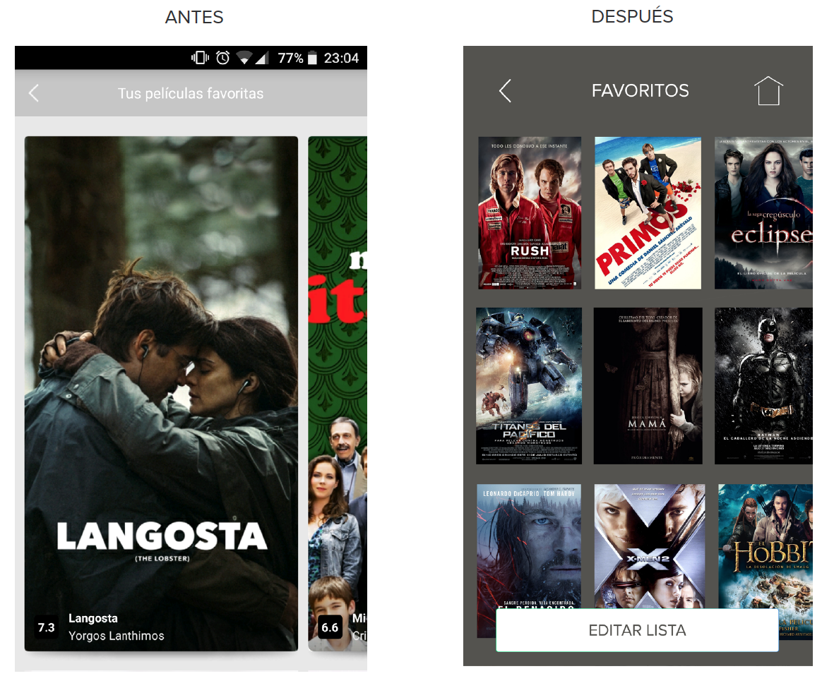
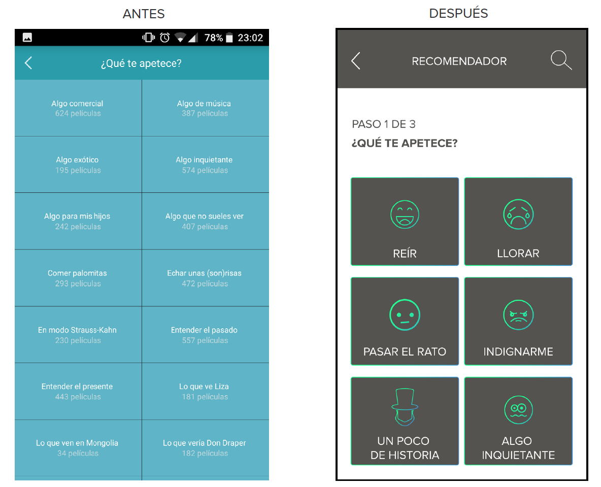
Filmin has an extensive database of films, series, shorts, festivals, etc. that users are not able to match as they are not organized in a clear way. For this reason, it is proposed to restructure the filters and categories of the application in a simpler way and also by adding a direct search engine and a recommendation engine in case of not knowing exactly what to see.
Information Architecture
The new information architecture of the application tries to correct the errors of the old workflows. Thanks to all the previous research, such as card sorting, affinity map, people, etc. this new structure is defined in which we find in the home with a click the user lists and the “follow” section.
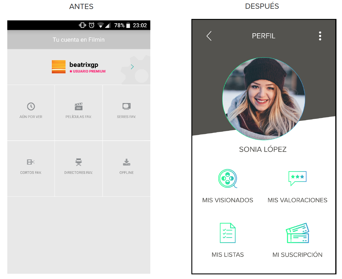
The search form has also been optimized. In this new architecture, we find a single search engine in which we find all the categories that we can find in the Filmin website plus a recommender. In addition, on the same home page, there is a hamburger menu with which we can access the least used sections of the application, such as the profile, give away Filmin and the configuration of the application on the mobile.

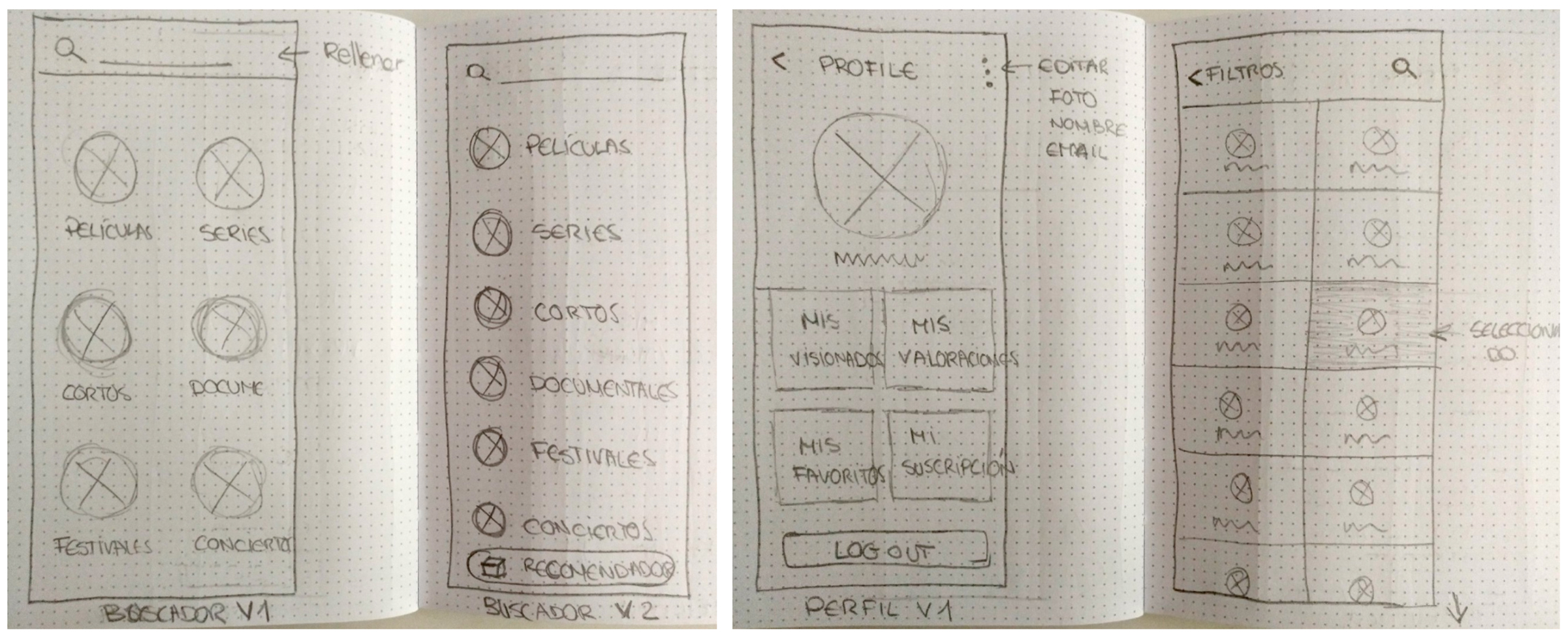
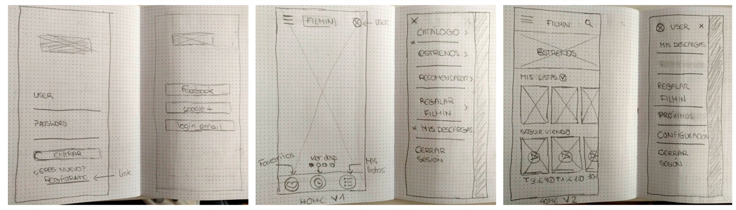
Lo-Fi Wireframes
The next part of the process involved deepening pain points, mapping relevant task flows and devising solutions through prototypes of paper user interface.
Several sketches were made with different versions in Lo-Fi (low fidelity) so that there would be no commitment to a single design. The main objective was to create an easy flow and a clearer way to navigate through the different categories Filmin offers.
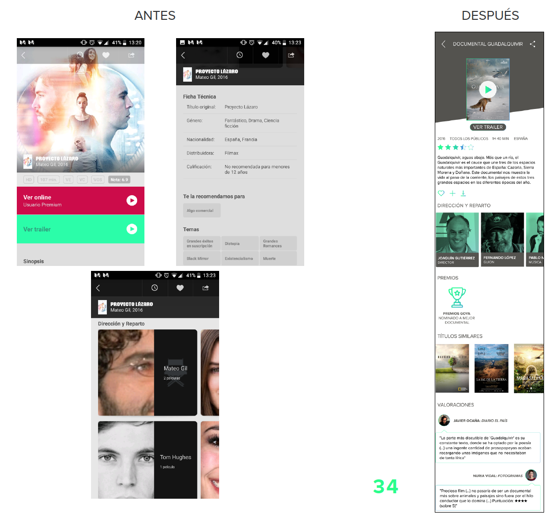
Comparison of current application with redesign

Prototype
You can visit the prototype in this link below:
Re-evaluation of design
The re-evaluation of the redesign has been carried out through usability tests in exactly the same way as in the previous research. This test was carried out on one of the five people previously tested in person and the rest were sent the prototype via web and a questionnaire to be filled in to obtain feedback from the experience with the application since due to the dates, it was not possible to contact them in person.
These five people were asked to perform a total of 5 tasks with the application, which were as follows:
- Create a new list.
- Start watching a series or movie and see which chapter you’ve stayed for.
- Find the Festivals section.
- Save a director/writer as a favorite.
- Start watching a movie that had previously been saved in the favorites list.
The results of the usability test were as follows:

Conclusions
This UX case study has been a challenging and stimulating experience for me as it has provided an opportunity to explore ways to improve one of my favorite applications and enrich my design skills by creating a solution from start to finish.
Many people expressed confusion and frustration as they browsed through the Filmin application simply to search for a movie or save a movie to a list. I learned that the root of the mismatch between the application experience and the mental models of many users was that users expected a Netflix-like experience because all or almost all of them have used Netflix. That’s why some of the changes in the redesign have coincided with the mobile application of Netflix, for example, the horizontal scroll that is increasingly used on mobiles for the good use of the screen.
Thanks to all the UX techniques and the re-evaluation of the redesign of the application, it has been possible to improve the user experience with the application by 76%.
For Filmin, this would mean increased engagement and retention of new users, leading to greater value in the customer experience.
P.S.: I’m sorry that the graphics and infographics are in Spanish, as this project was carried out in Barcelona for a Spanish Public University.
©Beatriz Gómez Pérez. All rights reserved.
©Beatriz Gómez Pérez. All rights reserved.
©Beatriz Gómez Pérez. All rights reserved.