Revamping CUPRA's Car Configurator
Crafting an Immersive Car Customization Experience
The challenge
The challenge for the Car Configurator project was to completely overhaul and enhance CUPRA's existing car customization experience to create a user-friendly, visually engaging, and seamless interface that would empower users to effortlessly personalize their dream CUPRA vehicles. This involved addressing various complexities, including the integration of intricate car model details, ensuring compatibility across multiple devices, and optimizing the configurator for efficient use on both desktop and mobile platforms. The goal was to elevate the configurator into an immersive and enjoyable journey for users, reflecting the premium and dynamic essence of the CUPRA brand.
ROLE
UX/UI Designer
CLIENT
CUPRA (SEAT)
PLATFORM
PLATFORM
Website
TOOLS
Sketch, Flinto, Principle, Zeplin
METHODS
Personas, User Flow, Surveys, Tree testing, Card Sorting, User testing
DURATION
6 months
Objectives
The main objective was to redesign the CUPRA car configurator in order to:
- Increase the number of visits to the configurator, so the configuration process should be easy.
- Increase the number of completed configuration processes. Increase CUPRA's knowledge of financial services, as well as new brand accessories.
- Increase the number of configurations saved in CUPRA ID or through PDF download of the configuration.
Methodology
We started this project with a meeting with stakeholders and product owners to know the main objectives of this project.
Then we did a benchmark to know more about the competition's configurators.
Once this benchmark was done, we had a meeting with the product owners about the approach they wanted to give to the CUPRA configurator.
Then we started to develop the sitemap of the configurator and the user flow with all the possible variables.
Then we started to sketch wireframes in low fidelity and then do a usability test.
Benchmark
This analysis consisted of the main contents and structure of the brands most related to CUPRA to learn more about the configurators of the competition. It consisted of an exhaustive analysis of 20 car brands.


Affinity Map
We made an affinity map to find the strengths and weaknesses of when a person from our target audience is going to make the configuration of their ideal car.
We spent a week doing this affinity map in-depth to know in depth the points to highlight and draw conclusions.

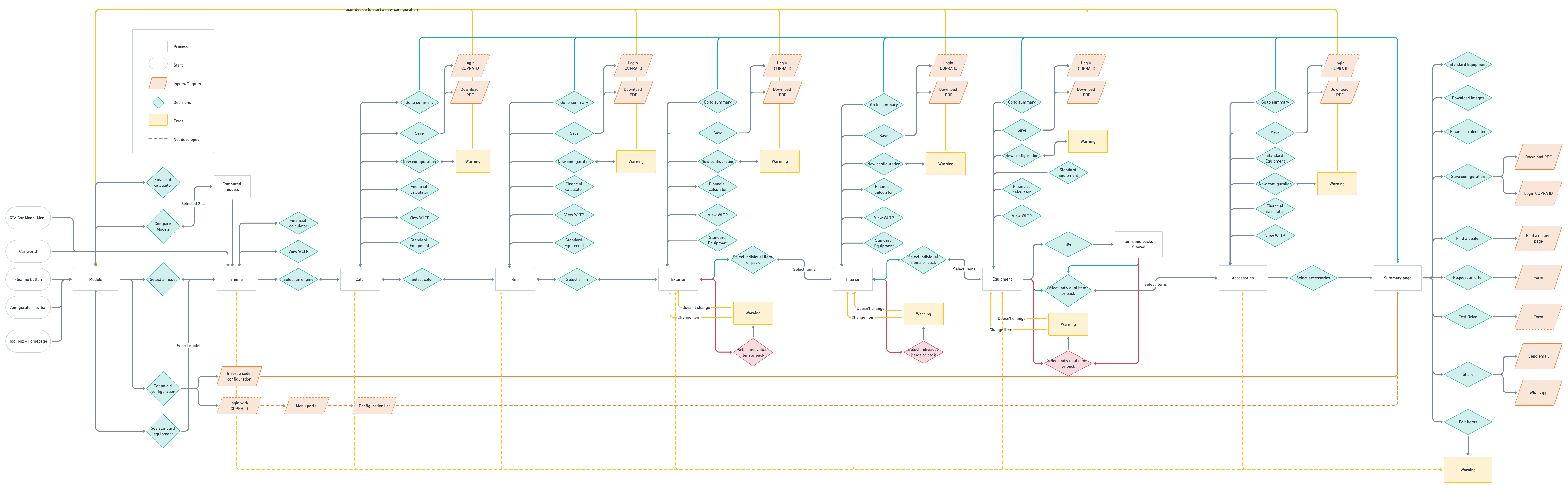
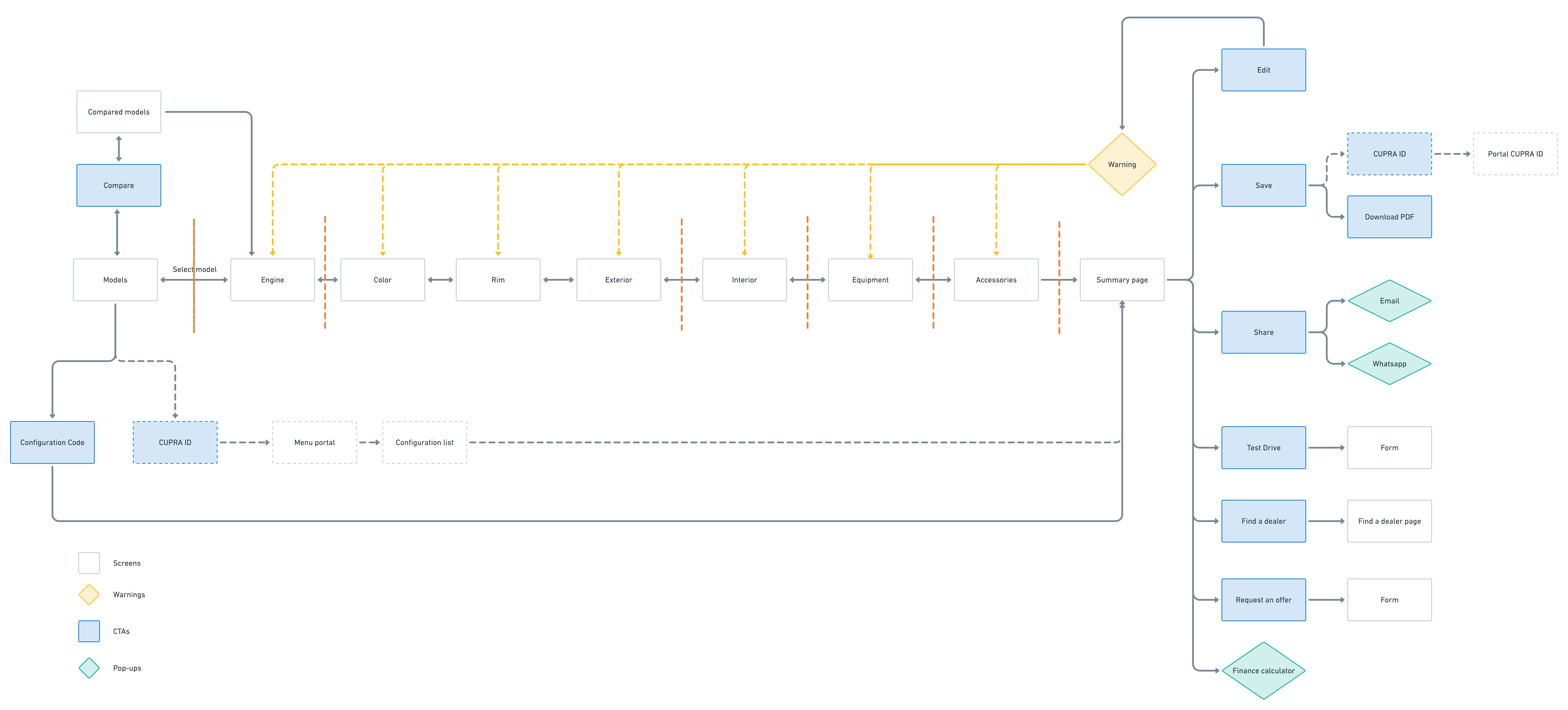
Sitemap & User-flow
This analysis consisted of the main contents and structure of the brands most related to CUPRA to learn more about the configurators of the competition. It consisted of an exhaustive analysis of 20 car brands.
Tree Testing
Once we had a solid structure about what the structure of the configuration process should look like, we did a tree testing to see if this structure makes sense. These were the results: These were the results:
Lo-Fi Wireframe
After having the basis of the clear structure and content of each section we began to make wireframes in low fidelity.
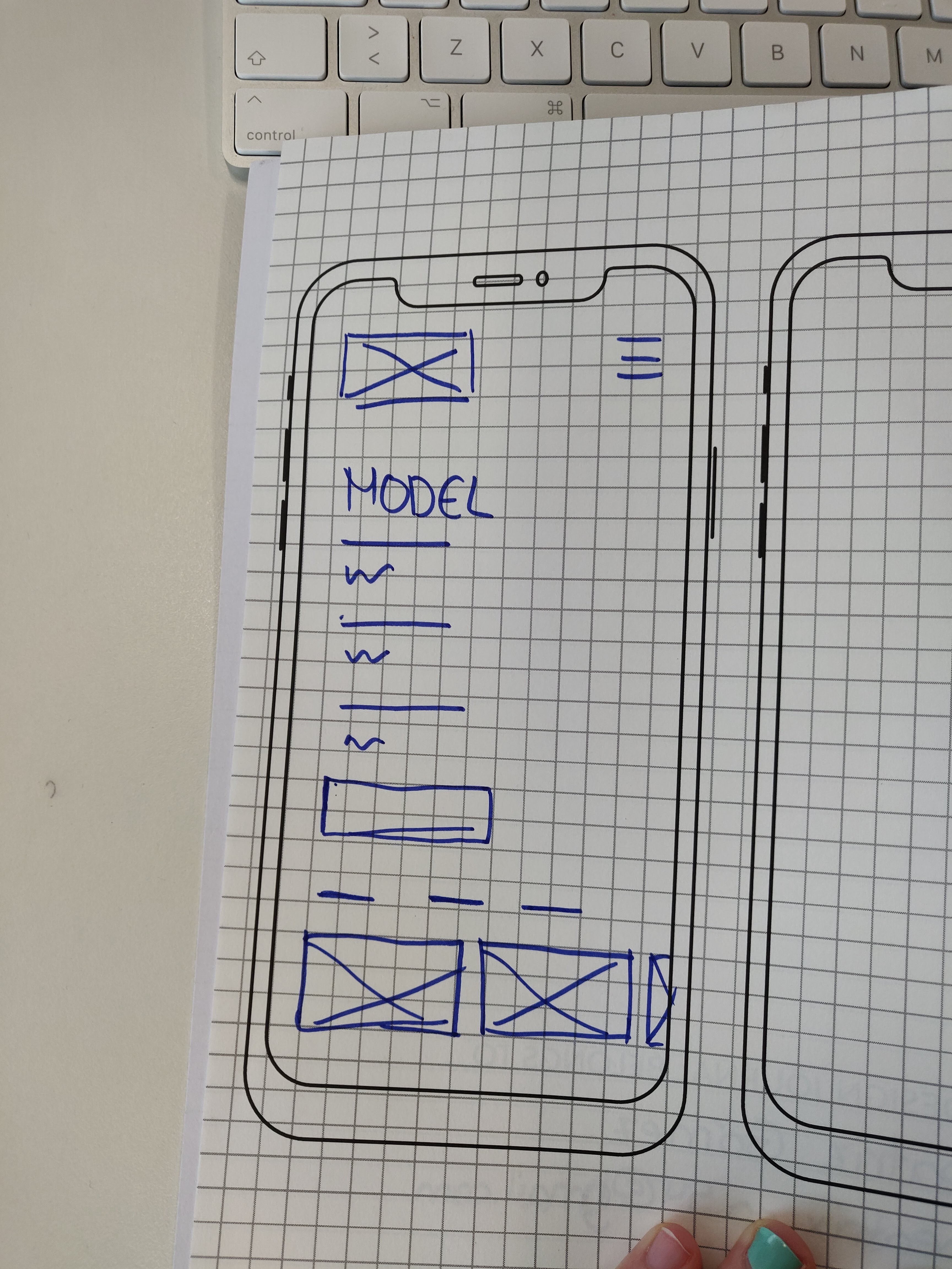
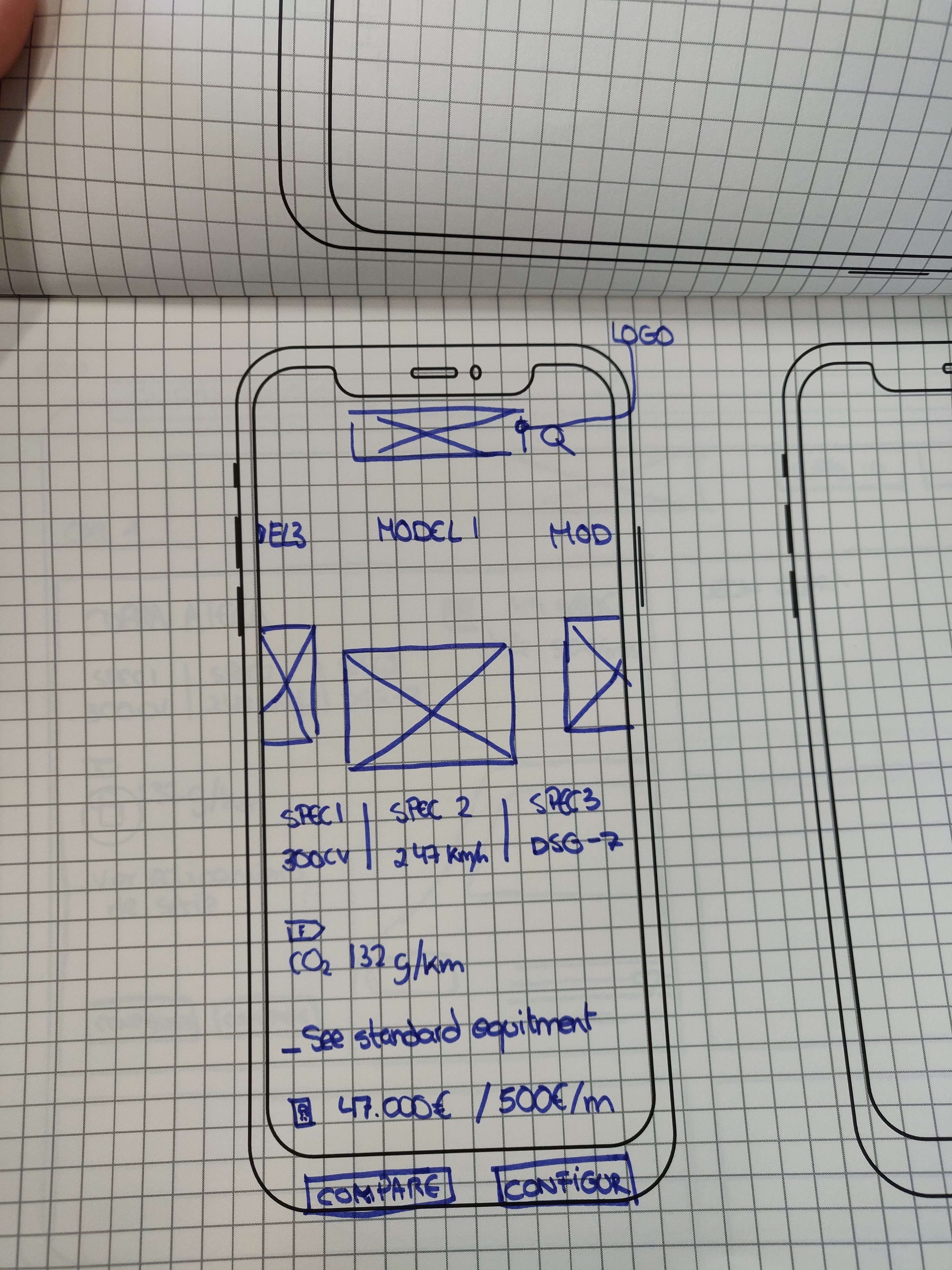
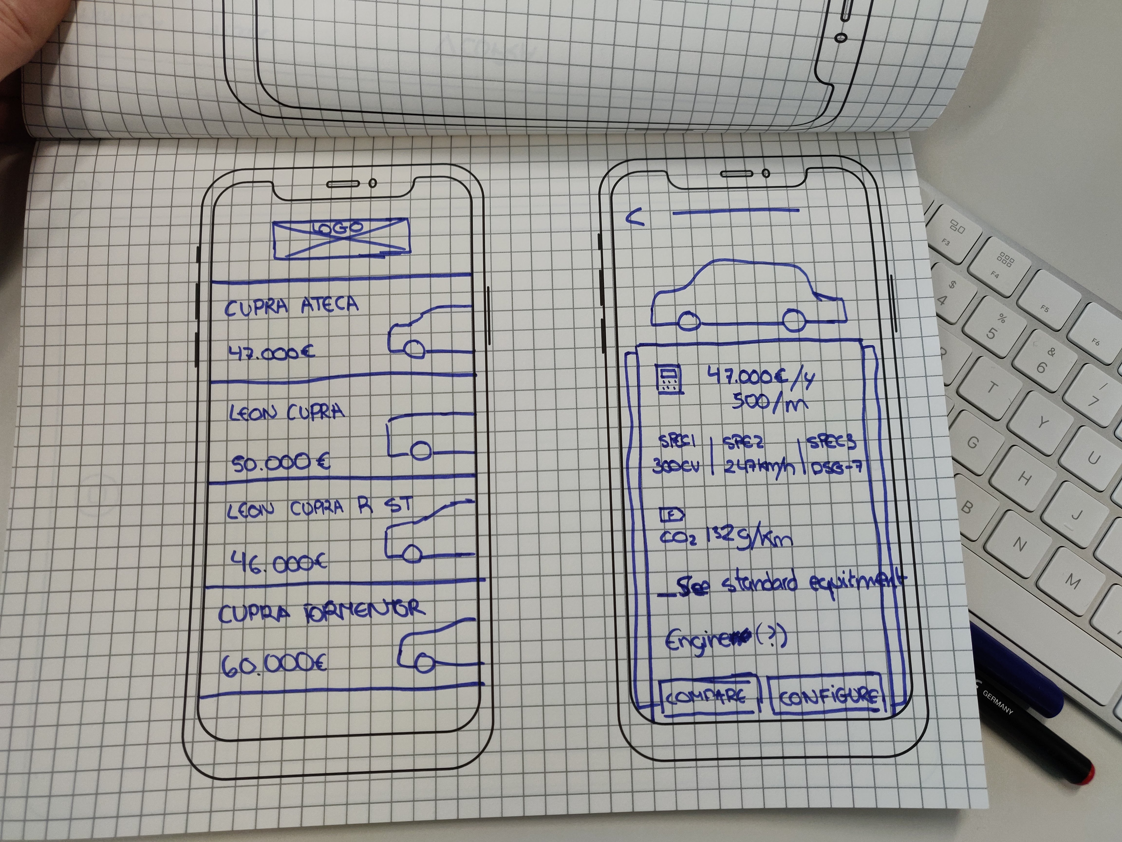
To present the client we made a rapid prototype in Invision:
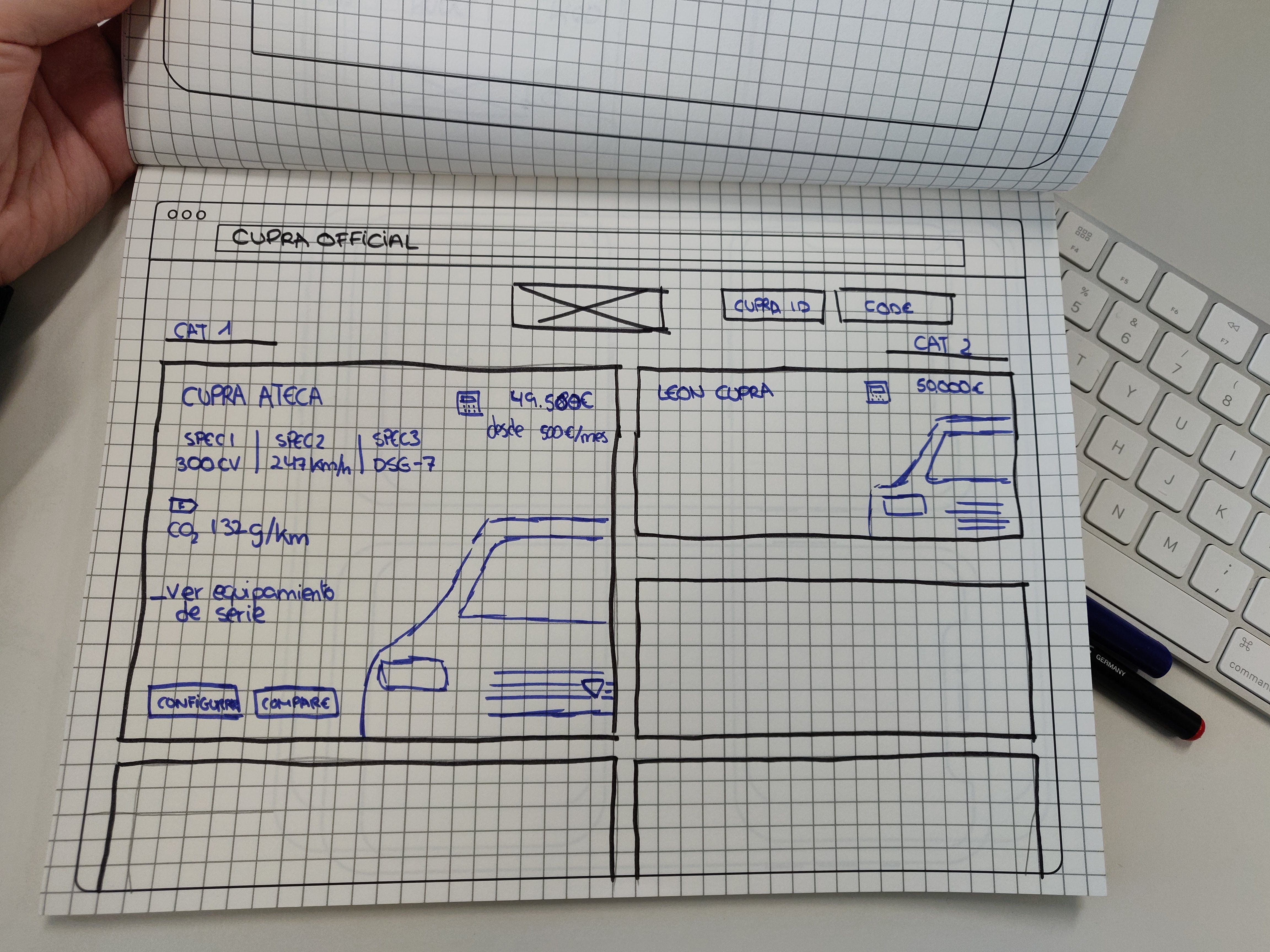
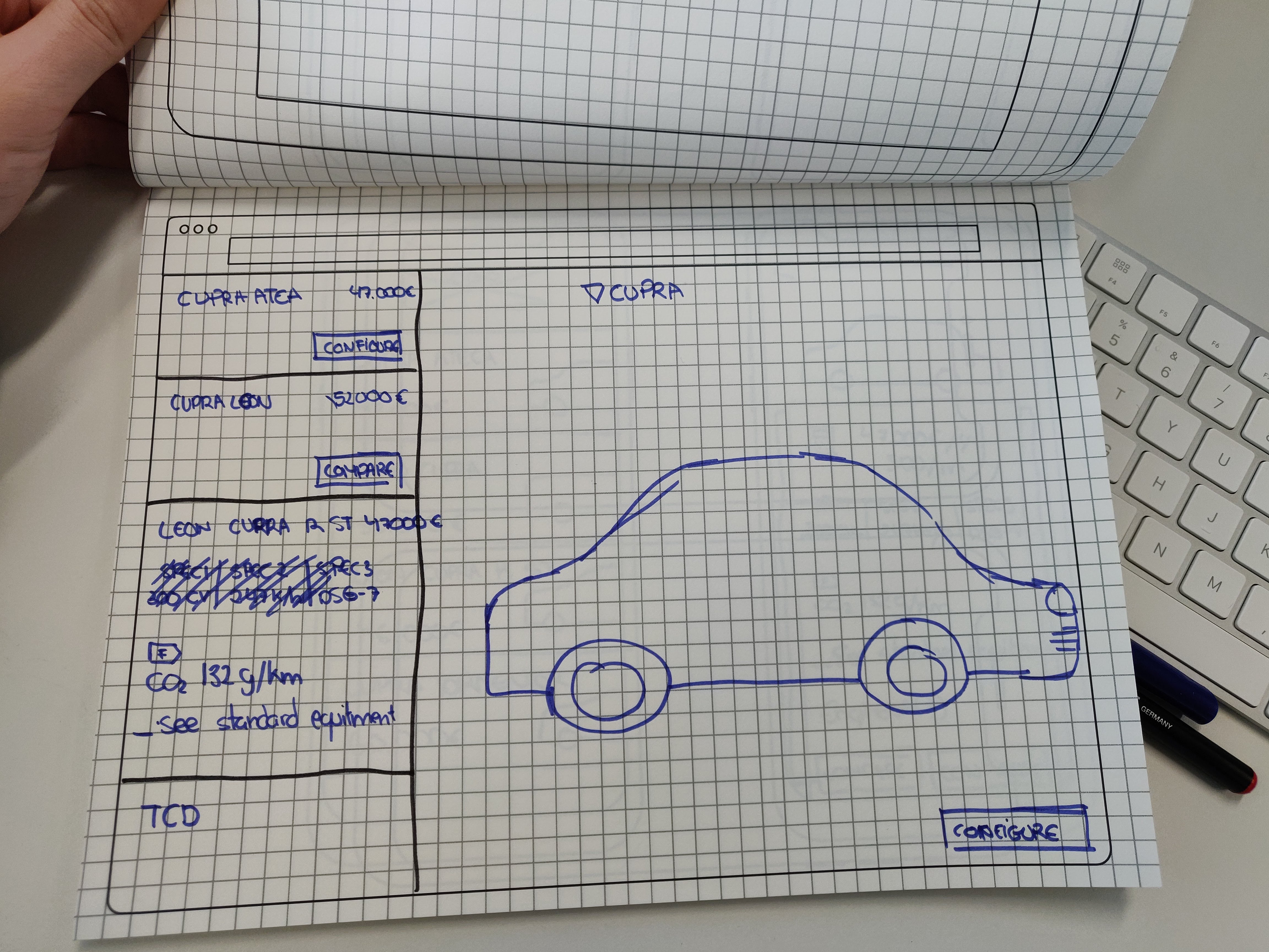
Hi-Fi Wireframe
After the meeting with the client, we applied the feedback that he gave us. Although in this case, they liked the design a lot so we didn't have to make many changes.
The next step was to pass this design to High Loyalty for the product owners to advance the customer look&feel of this configurator.
This was the result of this wireframe in high fidelity:
User Testing
Scope & Objectives
Scope:
Evaluate the flow of the CUPRA CC for both, the mobile and the desktop versions. The test includes the following aspects: logic of the navigation, interactions, items discoverability, content and labeling and users perception of the car configurator and CUPRA products.
Objectives:
- Assess if users are able to set up a car with this tool and if the steps to do so are understood.
- Discover if what car features are being selected along the set up are obvious to users. Is it clear for the users which options are compulsory and which ones are of their choice?
- Explore the discoverability of the relevant elements such as CTAs, menús, etc
- Investigate whether the main interactions and micro-interactions are understood.
- Gather users’ perception of the system's usefulness and usability as well as their acceptability.
- Discover if the web and the product are aligned with users’ perceptions about the CUPRA brand.
- Ensure that all the relevant information to the users is available at each step of the configuration.
Methodology
- In-person usability test
- Number of participants: 12 testers. Half of the participants (6) will be presented the prototype on mobile and the other half (6) on desktop.
- Testing device: Desktop and mobile. Prototype software: Flinto.
- The session will be videotaped: screen recording, participant - interaction recording, participant recording. Testers will be asked to think aloud.
- Overall test time: around 1 hour
- Language of the test: Spanish
User Tasks
Happy flow car configuration
Review the summary page and save the configuration
Modify and start a new configuration
Incompatibility recovery
Final design
Final design to be used for the user test:
©Beatriz Gómez Pérez. All rights reserved.
©Beatriz Gómez Pérez. All rights reserved.
©Beatriz Gómez Pérez. All rights reserved.